
HAYDN AI Writing Assistant: Marketing Website

My role:
UX/UI Designer — Logo Designer
Duration of Project:
2 weeks
Process:
Ideation — Design — Testing — Redesign
Overview
HAYDN is an AI powered writing assistant developed to help make writing easier and faster for marketers of all kinds: email, social media, bloggers, content writers, social media managers, and more. They need a S.a.a.S. (Software As A Service) marketing website to attract new users and sell their product.
Defining the Problem Opportunity ☺︎
Since the target audience is marketers of all kinds, I had to consider that marketing to marketers may require a careful look at how we handle copy and the ease at which users can sign up for the service. I realized the problem lay not in how to prove that HAYDN is a shiny new product worth spending money on, but how to ensure a sense of trust among its users that it can actually make their workloads lighter.
HAYDN is an AI writing assistant, but what they’re selling is a sense of wellbeing. The problem is that HAYDN does not yet have a compelling marketing website that expresses the human-centered benefits of their product. Making an effective website will convert more users, therefore improving their quality of life. 🧘
Highlighting the Human
While AI is becoming more common, I assume that there are still many of us who feel skeptical of its strengths and weaknesses. To sell HAYDN to writers, I wanted to create a warm, relaxed look and feel to the website. I thought it best not to oversell the power of AI, but a feeling of empowerment users will feel when they get more accomplished and spend more of their time doing what they want.
Test Plan
The main goal for my test plan was to make sure our target users would be able to effortlessly sign up for a HAYDN subscription. While the loftier goal introducing people to products that will made their lives better, the marketing website still has to perform its duties. This plan helped inform the user flows and sketches for the interface, making the flow as efficient as possible to get the user to a find the right subscription tier for them.

Design Path
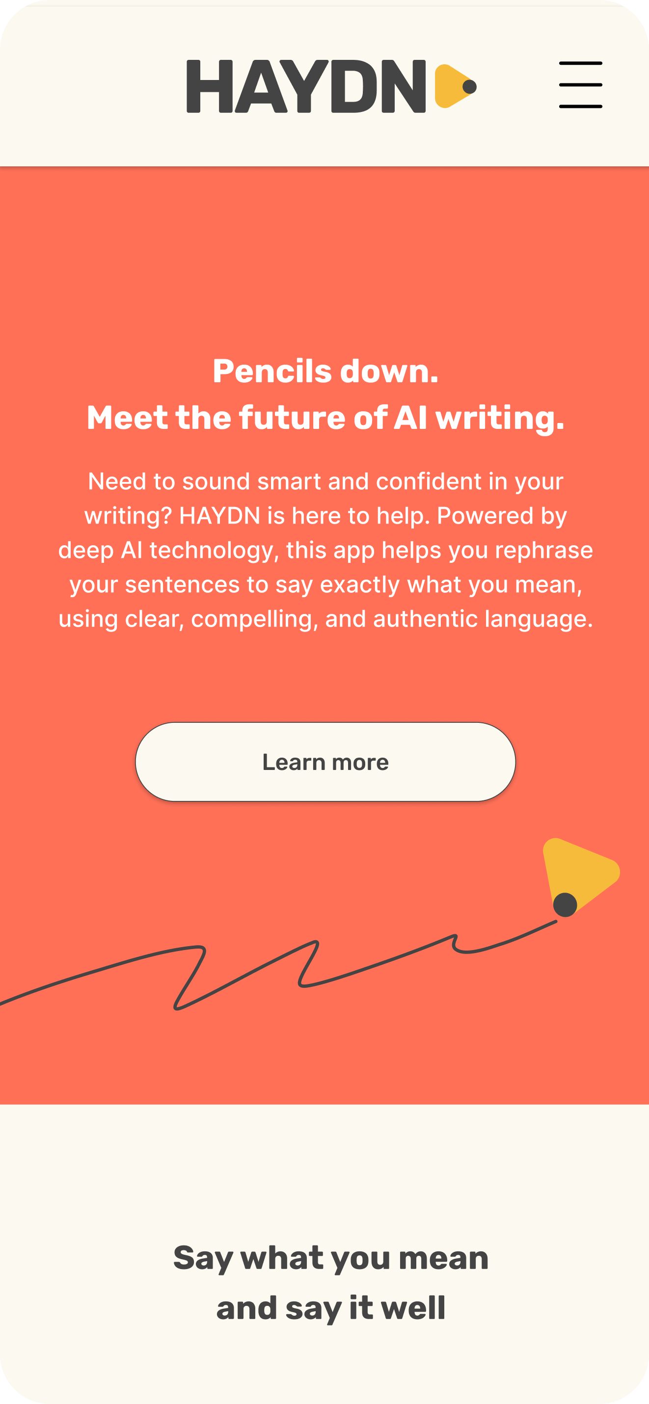
The first thing that needed to be designed was a logo. I wanted the logo to “draw” (lol) on the idea of writing by hand. Using the brand’s chosen font, Rubik, the word HAYDN becomes a neat, clean rectangle.
By adding the yellow and grey tip to the end of the word, a pencil was created. The combination of simple typography and a symbol representing a writing tool provided me with a versatile logo.
The pencil tip can be removed and used as a little motif throughout the website. Using iconography borrowed from the logo also reinforced the brand identity, and helps to make HAYDN synonymous with writing.


In my early rapid ideation sketches, I used a lot of the pencil motif.
While I still believe the pencil and paper, “hands-on” style brings life into the AI product, and spotlights the user more than the technology, relying on it too much became a little messy. The placement of scribbles and lines were arbitrary, and could have caused issues when handing the design over to developers.
In my mid-fidelity sketches, I cleaned up the scribbles and used just a few hand-drawn lines, mostly to draw (no pun intended) attention to a few important lines of copy.

Here you can also see how I had chosen to set up my user flow from the home page to picking a subscription plan.
Right Copy in the Right Place
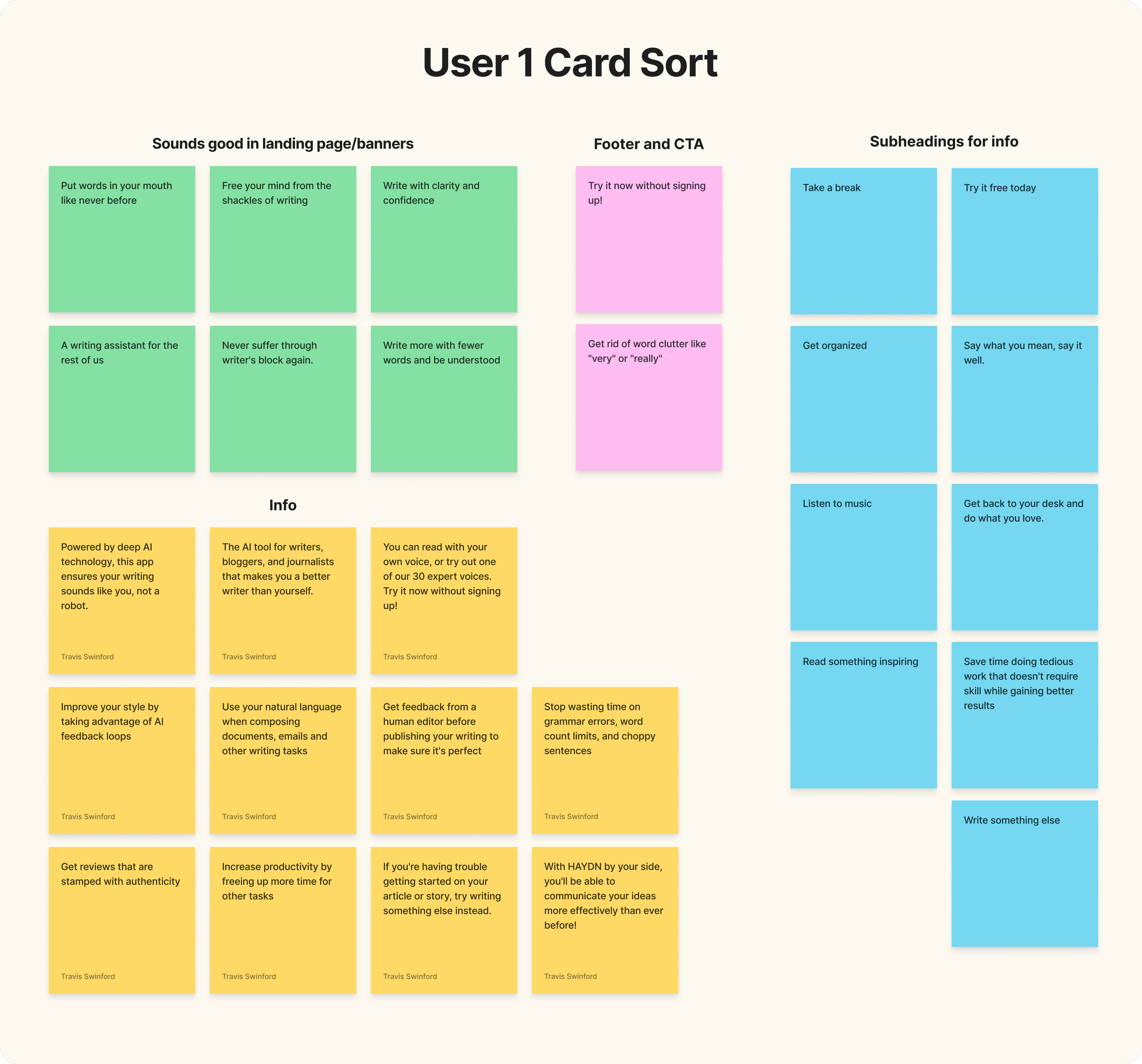
I used an open card sort with two participants to make sure I could maximize the effectiveness of the copy provided by HAYDN. Each with their own Figjam file, the participants organized cards of copy I made and created their own categories for each group.
What I learned from their groupings is that I had to consider the hierarchical and categorical differences in the segments of copy. For example, the line, “A writing assistant for the rest of us” was categorized as “Something good in landing page/banners” as well as “HAYDN Features”

User Test Results
After considering results from the card sort, I added copy and ran some usability tests. Other than a few button placement decisions, the mid-fi prototype proved to lead users to their destinations quickly and easily. With just a few bugs to fix, it was time to create my hi-fi wireframes and prototypes for mobile, desktop, and tablet. 😎

Hi-Fi Designs and Prototypes
Once the initial flow was completed and wireframes were ready, I created the main screens of the website.
I prioritized open space between sections of copy and CTA to bring breadth to the different screens. The openness gives the audience an ability to absorb all the information with as little strain as possible. I used HAYDN’s warm red and a tan to break up the sections and make information as readable as possible.
Try out the clickable mobile prototype here.

Tope of the homepage for tablet.

Top of the mobile homepage
Since this was a school project, and I didn’t have a screenshot of a real HAYDN in action, I made a mockup of what it could possibly look like based on other AI writing assistants.
Adding a screen shot to the marketing site gives the user a peek of the product and fosters trust between them and the brand.
Click below to see full wireframes for each device:


Screenshot of the homepage for desktop