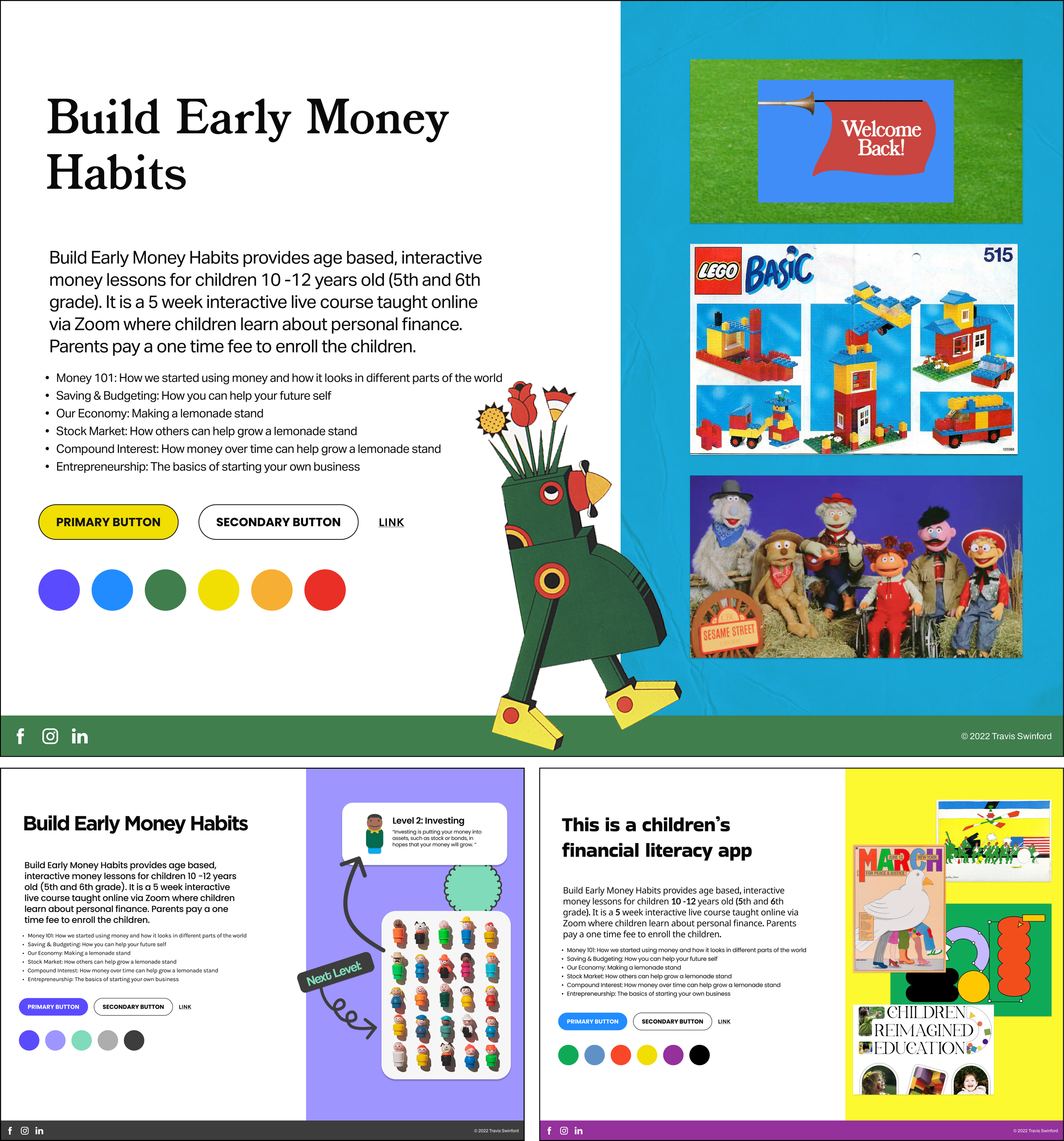
Build Early Money Habits — Visual Identity & UI Design
Teaching financial literacy through expansive worlds inspired by legendary innovators of children’s education (and talking lemons).
Client:
Build Early Money Habits
My Role:
UI Design, Art Direction
Duration of Project:
1 week
Prototype:
Click Here
Overview
Build Early Money Habits provides financial literacy education for children 10-12 years old via Zoom. They needed a brand identity to maintain consistent visual communication throughout their educational resources.
The initial ask was for a style guide to implement for parents to learn about the program, register their children, and receive educational resources. They also needed a digital experience for children to onboard the program and access the lessons.
There was a problem
The research provided by the client did not mention the success rate of this course, or if it had any lasting effect on children after it was over.
How can we increase retention levels so that this program can bring long-lasting benefits to its users?

My Big Idea
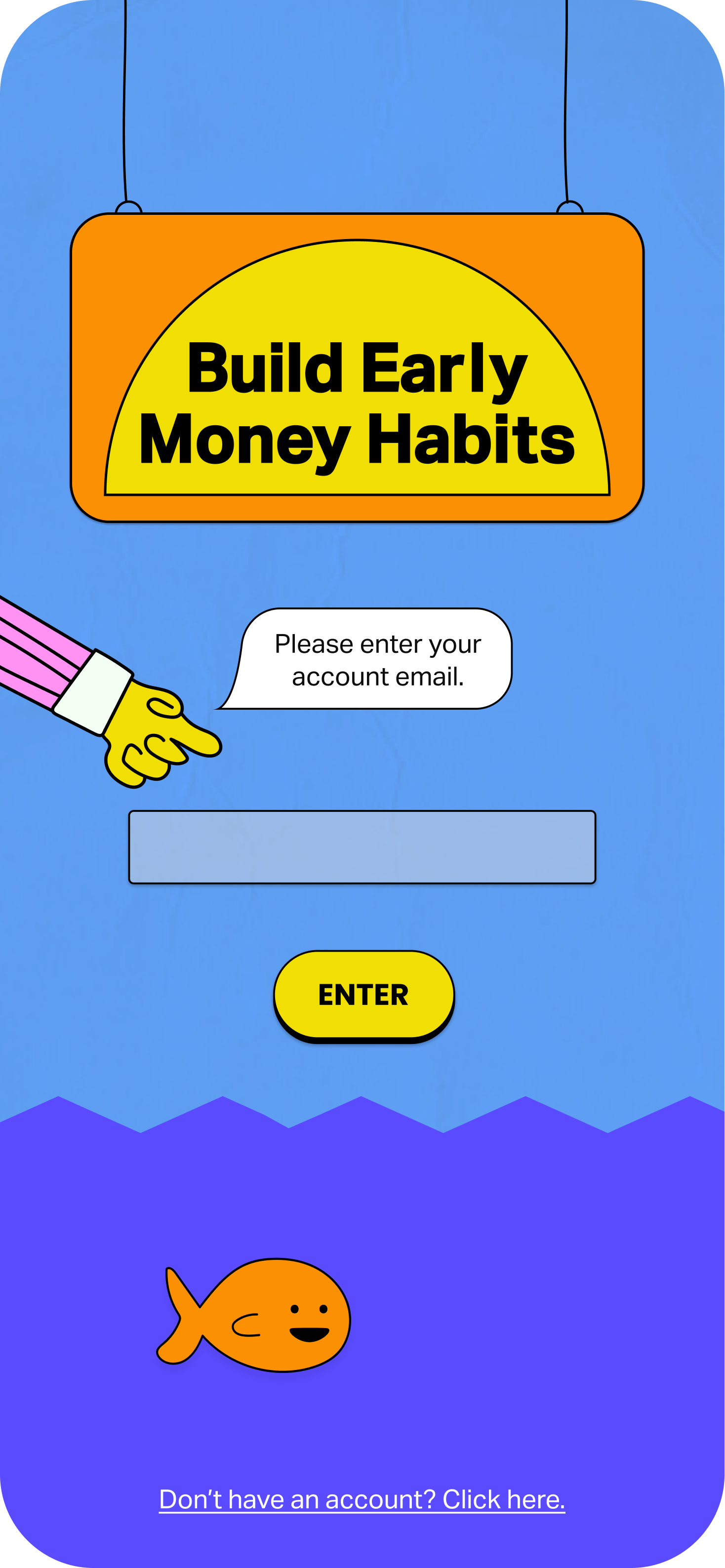
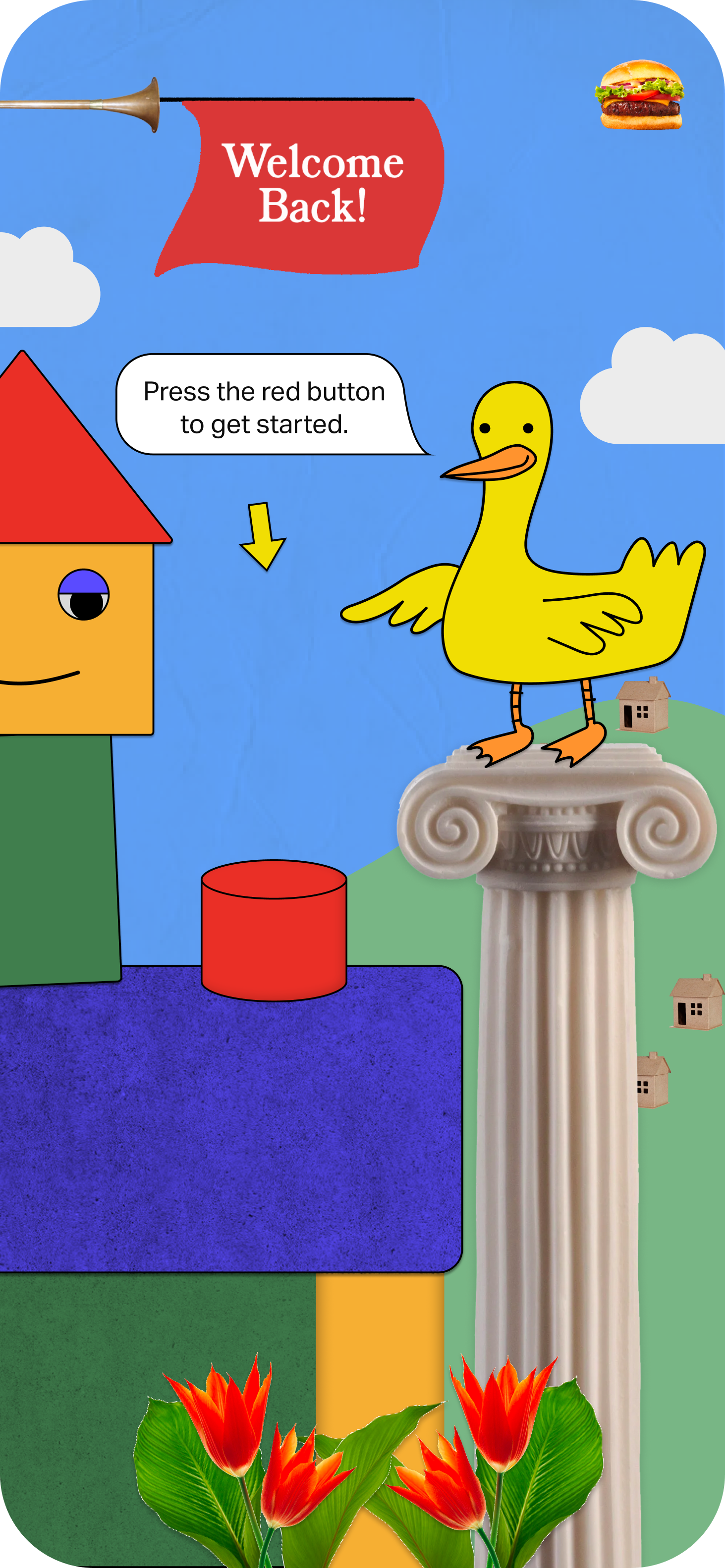
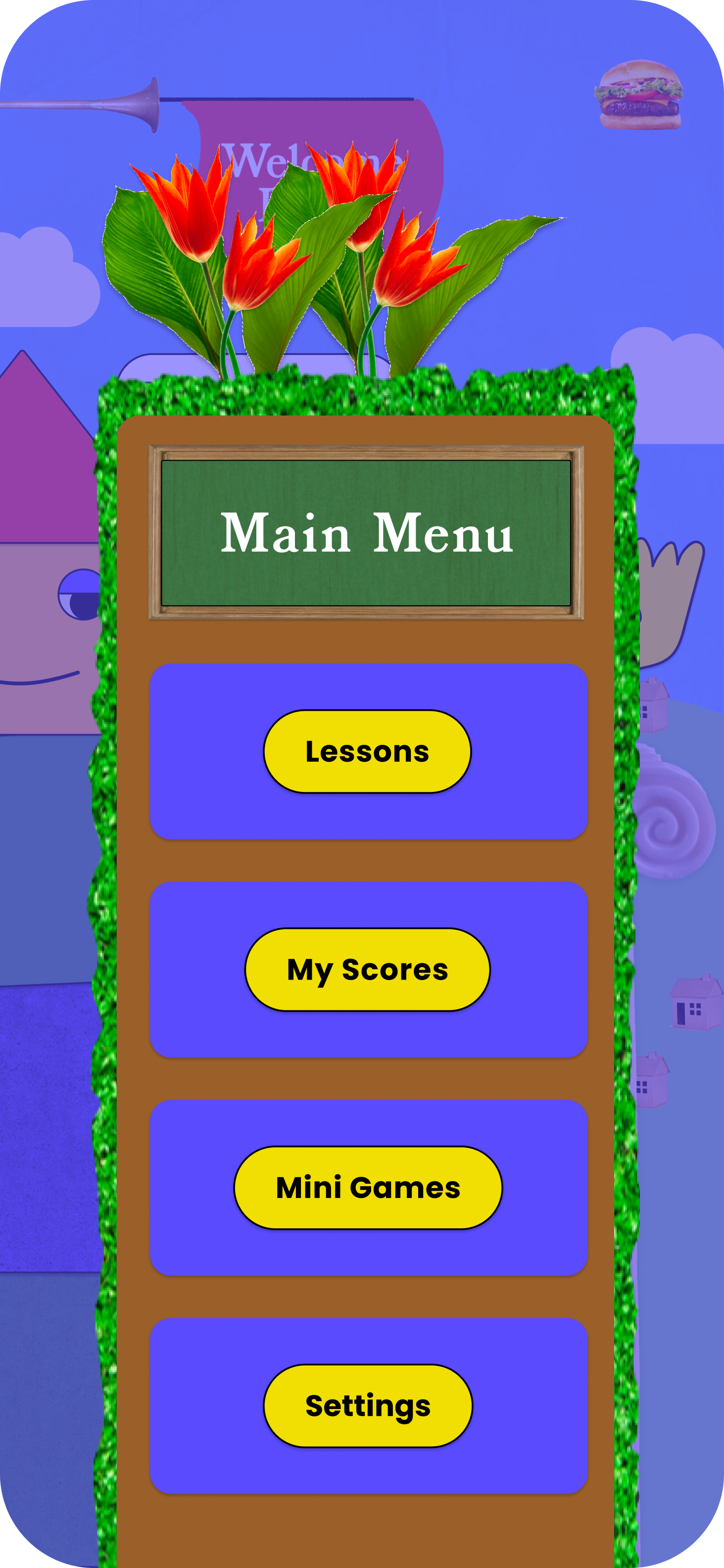
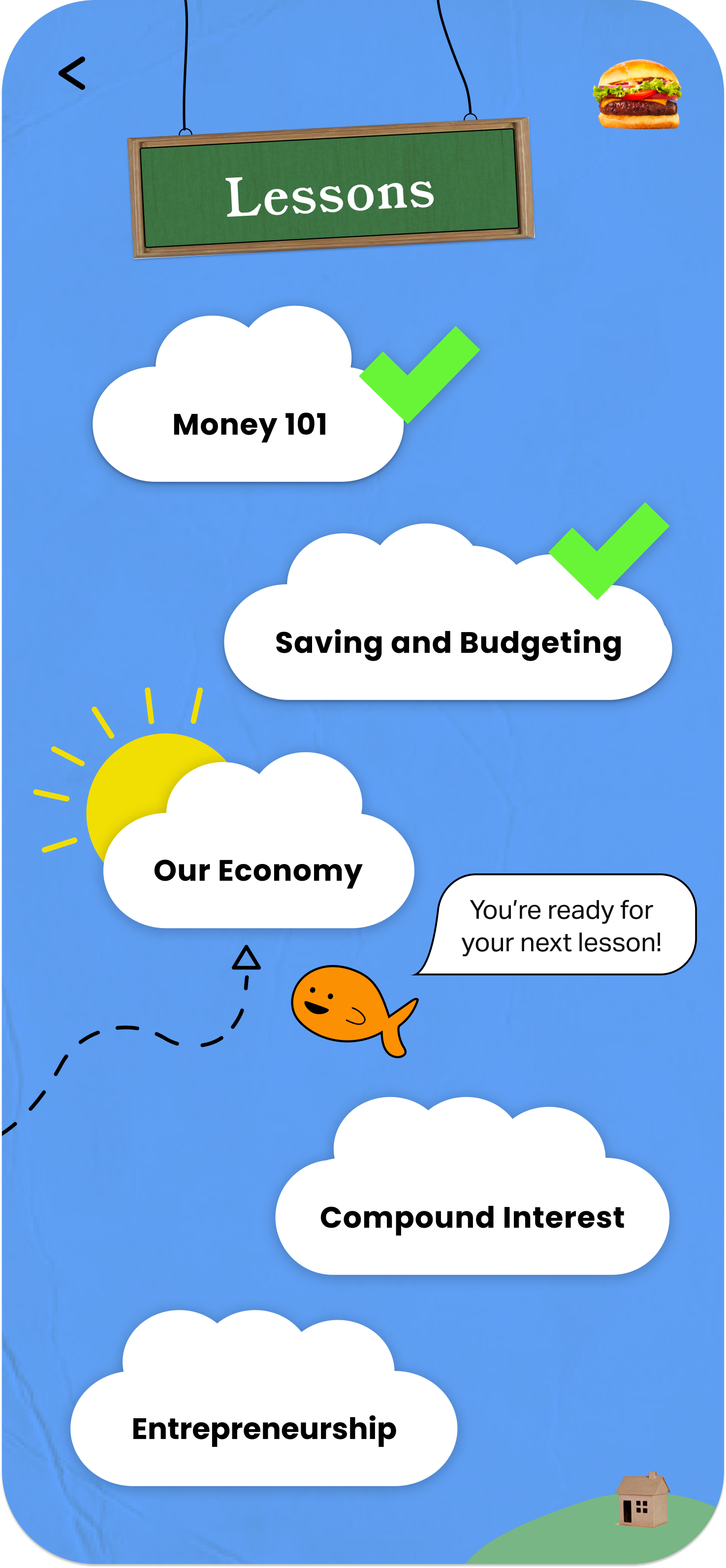
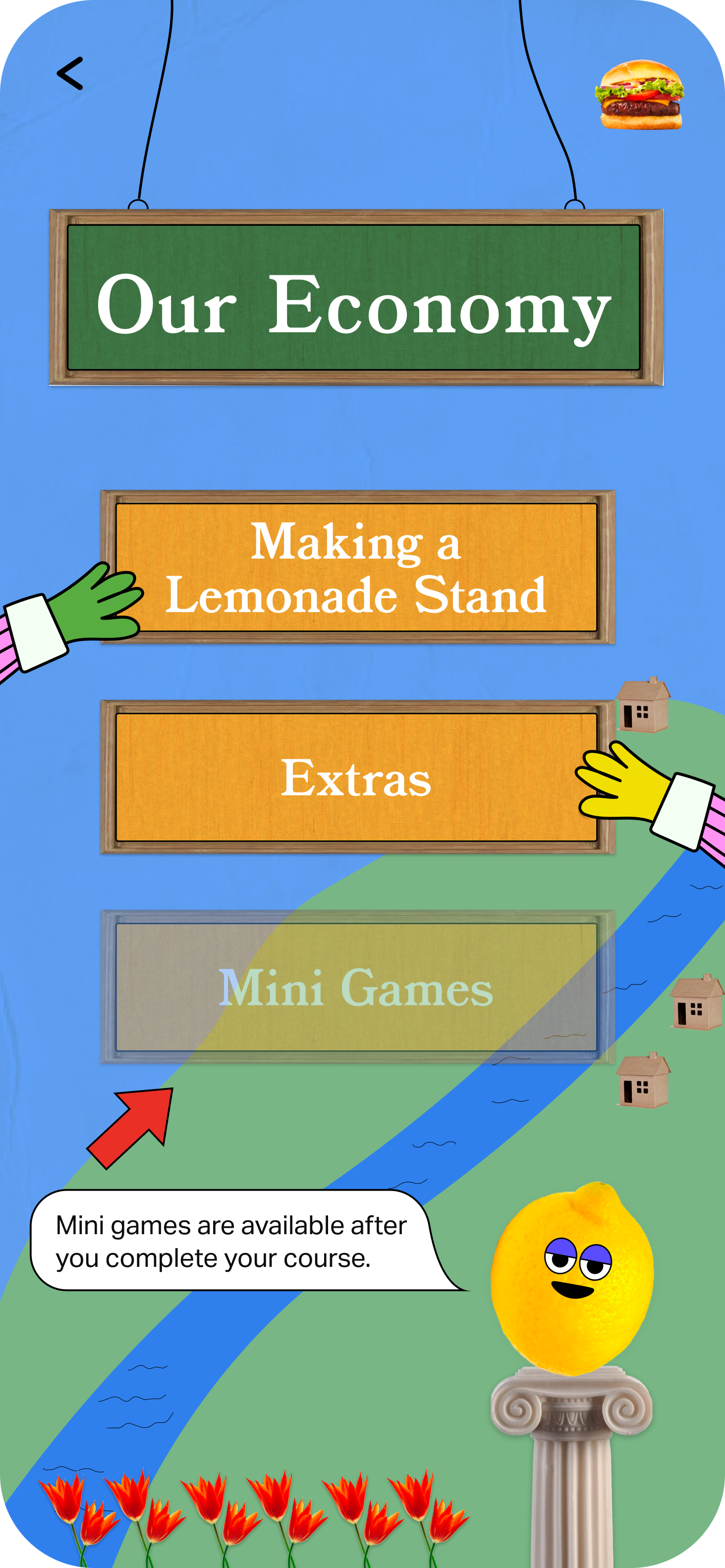
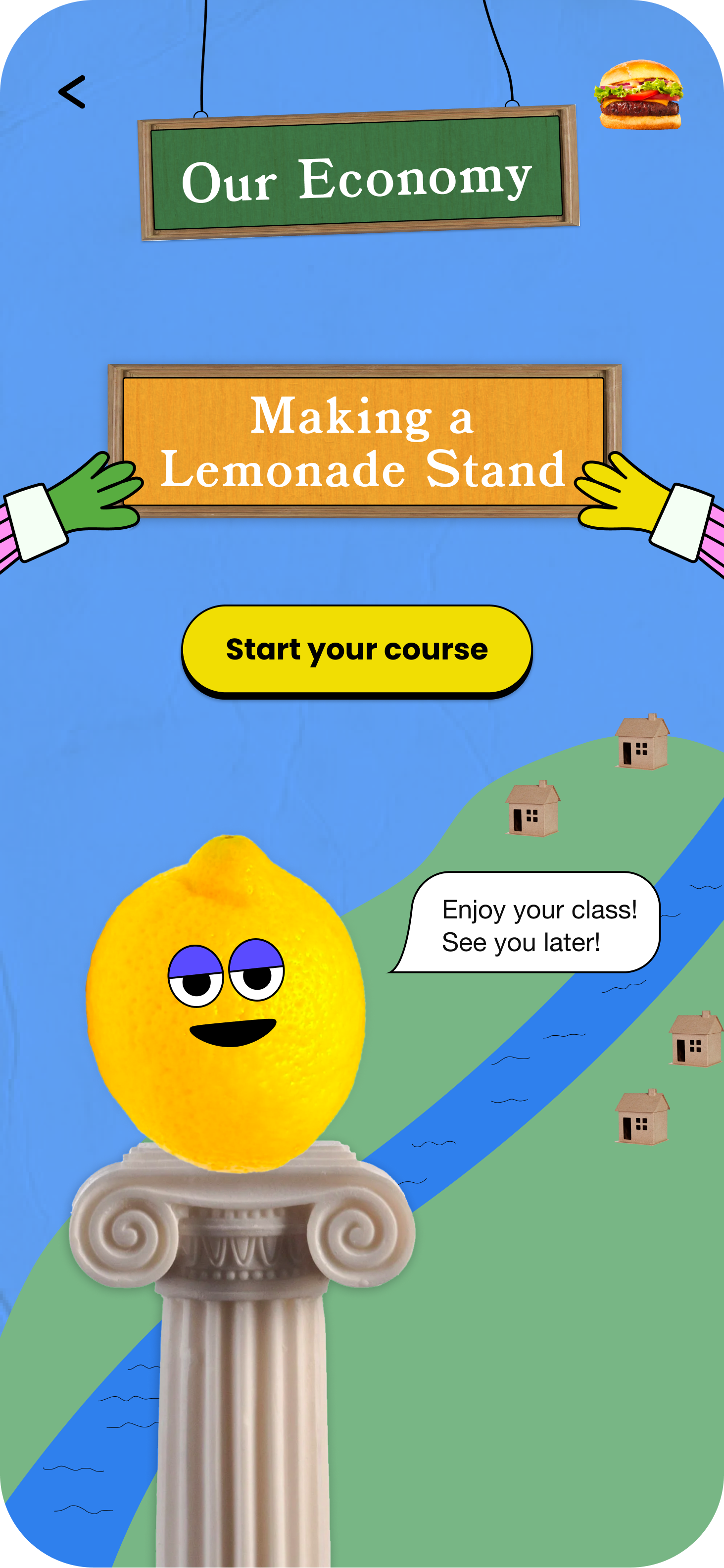
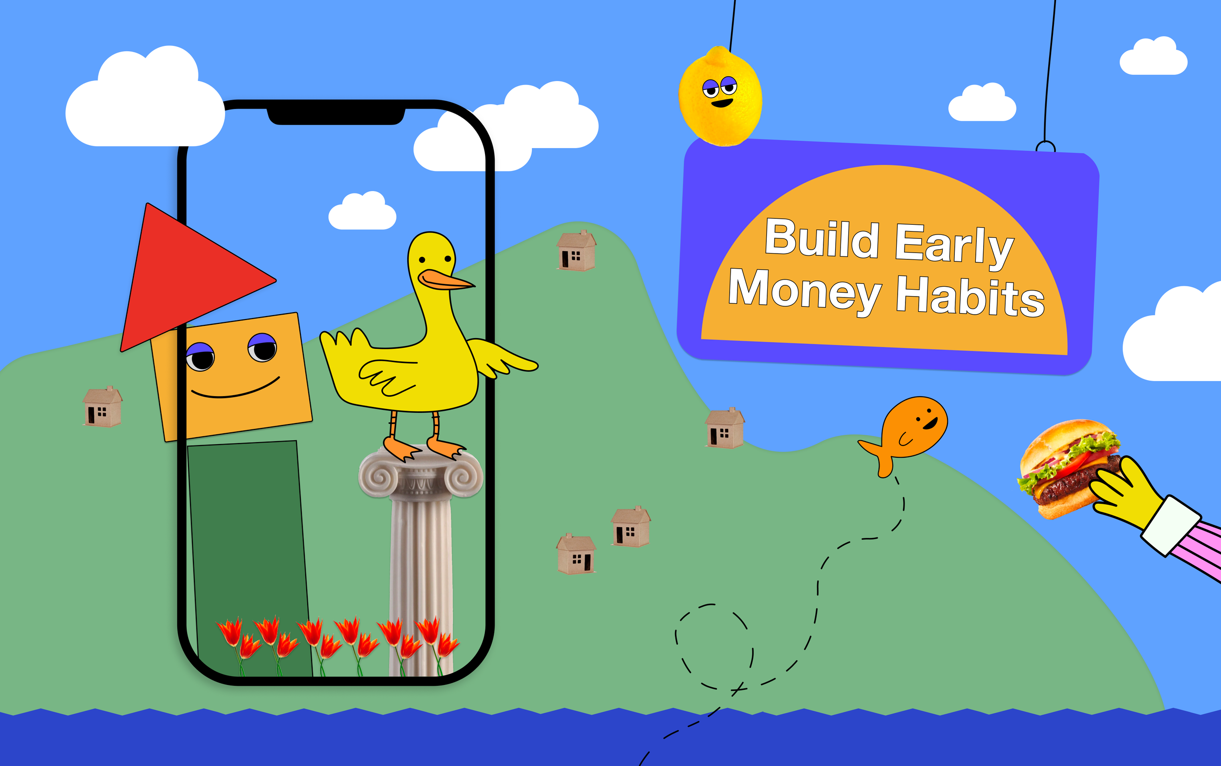
Build an interactive animated environment in which users perform their tasks and activate their next lesson, essentially designed like a task flow at the start of an old Super Mario video game.
If I could create a fun environment that encouraged curiosity and discovery, perhaps students would be more attracted to learning about financial literacy and will spend more time with it. By building an environment for accessing the resources, users could be able to contextualize the educational material, which can assist in memory retention—similar to a “Memory Palace”.
Visual Development
I wanted to build this little world with smiling shapes, cartoon animals, talking objects and other irreverent elements. I was inspired by how Sesame Street used advertising strategies to develop its visual identity in the early 1960’s to educate children. For my project, I applied this philosophy by combining various visual styles to create a fun, hodgepodge environment. My assumption was that discoverability, gamification, and humor would inspire children to be more interested in what they were learning.
A little research
Desirability testing showed that this stylistic assemblage proved to be a favorite among participants, young and old.
Using visual inspiration from Sesame Street, Legos, and the Brooklyn Children’s Museum mascot, created by Seymour Chwast, I was able to create an identity that had a timeless look and feel to it.
While the Build Early Money Habits digital experience may be new, many of us are used to having our imaginations stimulated by entering these little worlds, giving a sense of enchantment and curiosity.
Style Choices
I chose to use a rainbow of brightly saturated colors for the settings, characters and UI elements in the design to create an exciting, attractive experience for young users. A wide variety of colors was necessary to properly illustrate the characters and to highlight UI elements within their settings.
For fonts, I chose BookmanJFPro for headers to give an '“old timey” look to the signage within the little “world” of BEMH. Poppins and Aktiv Grotesk were used for buttons, body text and dialogue boxes for very clear readability. Since there is very little white space, with busy environments and bright colors, I decided that very simple font choices were best to keep the young users and their parents on path in their path through the experience.
Giving both sets of users direct cues and communication would hopefully allow for easy use while enjoying the colorful, fun environment. It was important to make sure the busy design would not prevent users from the primary goal: to learn financial literacy.
Designing by the seat of my pants
Due to time constraints (one week!) and the nature of this design, the standard wireframing process wasn’t feasible. Since the buttons were mostly built into the scenes for each screen, it made more sense to go from a few pencil sketches straight into building a high fidelity prototype.
Without enough time to fully plan a style guide before implementation, I had to develop the guide as I built the prototype. This would be absurd if I were building an entire digital product, but it worked for a simple flow illustrating how young users sign in and access their next lesson.
Try out the clickable mobile prototype here.