Project:
Personal/Exploration

My role:
Research / UX / UI

Overview

Formerly a UX research school project, Art Finder is a current project to discover the customer needs and design needs of creating an omnichannel app for discovering art and events happening around NYC. My goal is to create understand what it would take to create a product which could make discovery easy and enjoyable for the user and give galleries of all sizes and equal chance to reach their audience. Done right, such a product would give more attention to smaller galleries and invite more


Information Overload

The amount of galleries and events which occur in the NYC art world can be overwhelming, as can be the attempt to keep track of what we actually do want to see. As the information comes from various sources (IG, emails, text messages, reminders, calendars) it’s hard to synthesize it all into a clear itinerary. On top of this, there is a barrier of discovery: how can we find out about what we don’t know? Sites that highlight art-related events are often pay-to-play, so we’re still only seeing a tip of the iceberg.


The Challenge

Burdened by time-consuming planning and research, art lovers need an all-in-one mobile digital product to discover art galleries and events in their cities, allowing them to plan their visits and stay updated with their favorite spaces. This product also needs to offer a platform for galleries of any size to provide their information, allowing for a level playing field of access which gives users the ability to easily find the art that inspires them.


Doesn’t Something Like This Exist?

The short answer: yes and no.

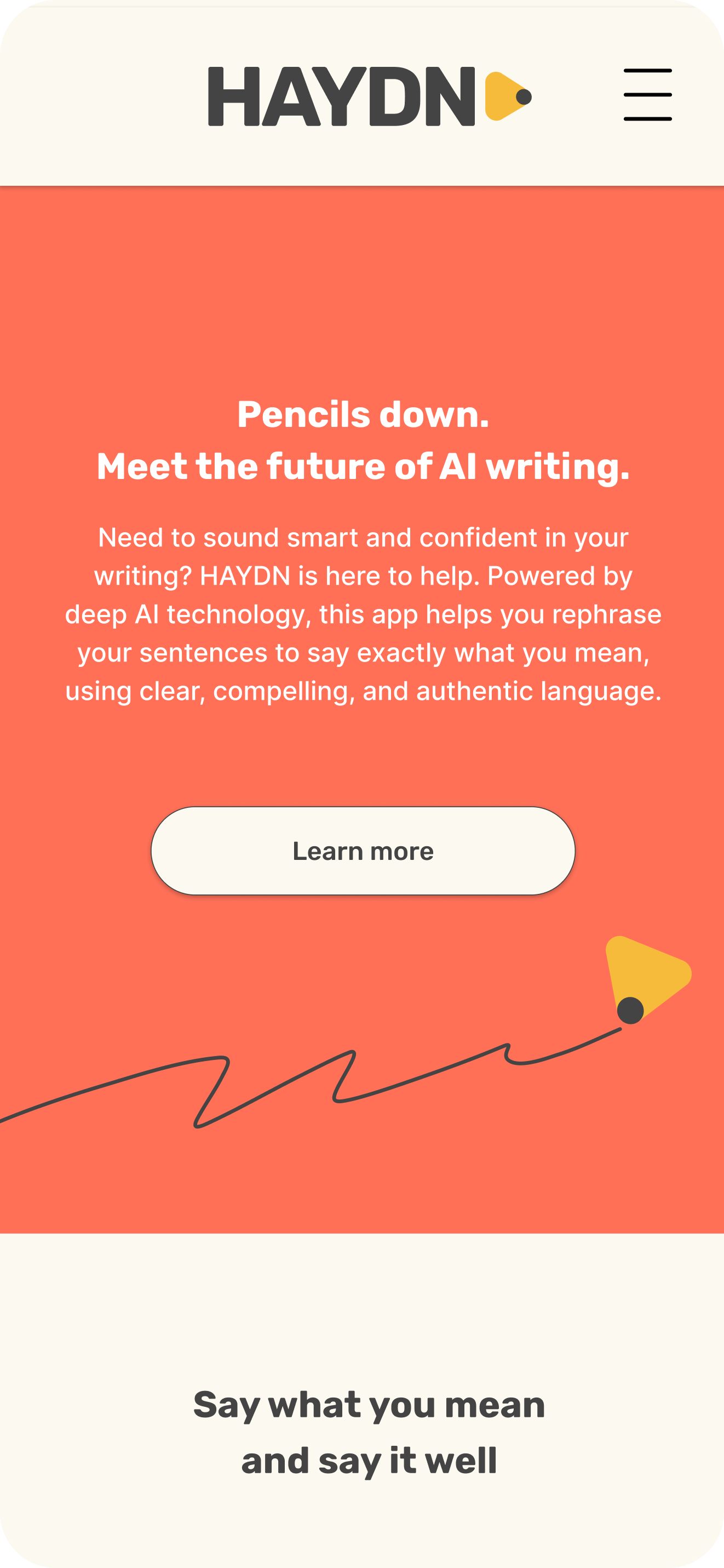
Upon embarking on this project, I already knew there were a few apps like Art Finder, primarily SeeSaw and Art Rabbit. After researching these competitors, it became obvious of a few flaws which I think Art Finder could address:

1. Visibility: Both of these main competitors had bad SEO and only be really looking for them could I find them to download.
2. SeeSaw’s UI is underwhelming enough to create a lack of cohesion between pages. Art-related information is there, but its purpose unclear.
3. SeeSaw lacks the ability to display events in a calendar. It also does not provide preview images, so users have to research the art on their own.
4. Art Rabbit is virtually unknown. While visually pleasing, and provides more than SeeSaw in terms of cohesion, its reach is insignificant.
5. SeeSaw requires galleries pay for exposure, therefore limiting their resources and audience.

 

Who Cares?

This might sound a little cynical, but it’s a question worth asking, especially in regards to making a product for the art world.

To find our who, in fact, cares, I created a survey to gain some qualitative data to learn about users’ interest and experience with seeing art shows. I shared a Google Form via my Instagram, which has a creative-leaning, but wide variety of followers. I thought this would provide a random enough response from participants who may be remotely interested in seeing art.


The response was unsurprising but exciting!

An overwhelming majority of participants do believe it’s personally and culturally fulfilling to see art in person.

Similarly, a majority of participants find it difficult to keep track of events, or even know where to look. And if they do find something interesting, it’s easy to lose track of the when and where of events. Try as we may, not everything gets put into a calendar, and certainly not all of the useful information.

The Audience is Always Right

Based on the feedback received, I was able to develop a persona for our target audience for now. Meet Michelle (via the Beatles), the target audience ambassador. While still in exploration and research, this persona provides enough pain points and interest in art to understand the main concerns of the user.


Information Organization

After better understanding our users and their needs, learning essential features for this product was next. This is where I currently am in this project. During initial sketching of some basic screens, I realized the vast amount of information shared to users would require a sophisticated understanding of categorization and information design. With dates, locations, types of events, and styles of art, creating a robust content filtering system would be essential for making information accessible and appealing. I think of apps like Netflix, Zillow, and Yelp when I consider best practices for organizing this content.


Project Summary

During the project, I was able to design a logo, develop mid-fi wireframes from rapid sketching, run usability testing, perform a card sort, and develop a hi-fi design and clickable prototype. Though there is more to learn and room for improvement, I’m happy with the final design, and it was nice to receive helpful feedback from participants.